Instructions:
Work through the following lab. For each of the Hands On blocks, you should:
- Complete the requested activities directly in your R script file.
- Answer the questions on a clean sheet of notebook paper, labeling each answer with their corresponding question name, e.g. Question 1, Question 2, etc. Your answers should be in complete sentences, and should be worded in terms of the problem.
- You should submit the sheet with your written answers to the questions at the beginning of class on January 30th.
- You should upload your completed R script to eCampus, under the assignment Lab 1 by the beginning of class on January 30th.
You are encouraged to work together, but you should state at the top of the sheet with your written answers who you worked with.
Introduction to the Data
We will be working with a synthetic data set meant to resemble the weight loss outcomes reported in this paper. In the study, 609 overweight adults took part in a dietary weight loss intervention called the Diet Intervention Examining The Factors Interacting with Treatment Success (DIETFITS). The participants were randomized into one of two groups: a healthy low fat (HLF) diet or a healthy low carb (HLC) diet. As part of the intervention, the participants participated in 22 small group sessions that covered ways to incorporate the healthy diet into their lifestyle. Their weights were recorded before the intervention and at a 12-month follow up. We will be considering the change in their weights from baseline to followup,
\begin{align} \text{Weight Change} = (\text{Weight at Followup}) - (\text{Weight at Baseline}) \end{align}
The weight changes are reported in pounds.
Familiarizing Yourself with RStudio's IDE
By default, RStudio has three panels:
- the Console on the left, where you can enter per-line commands
- the Environment / History / Connections panel in the top-right, where you can see what variables have been declared and what commands you have run so far.
- The Files / Plots / Packages / Help / Viewer panel in the bottom-right, which shows the current working direction, any plots you have generated, and the packages you have installed.
For now, focus on the Files tab of the bottom-right panel. This shows your current working directory (where R looks for files, including data files), which you can see directly below the New Folder icon. Note that RStudio uses the word 'directory' for what you may think of as a 'folder.' This is a holdover from the pre-GUI days of computers, when all interactions with a computer were done through a command line. Unless you have already created any files, you should see start in an empty directory called R.
Creating an R Script File in RStudio
We start by creating an R script. An R script is a plain text file (like a .txt file), with the file suffix .R. A file suffix tells the operating system how to handle a file. For example, should it be opened with Microsoft Word (no!) or with RStudio (yes!)?
You create an blank R Script by selecting File > New File > R Script from the menu bar.
This will pull up the blank R Script in a top-left panel, moving the Console panel to the bottom-right.
Loading Data
Download the data from the course website by clicking the Lab 1 Data link under Lecture 2.
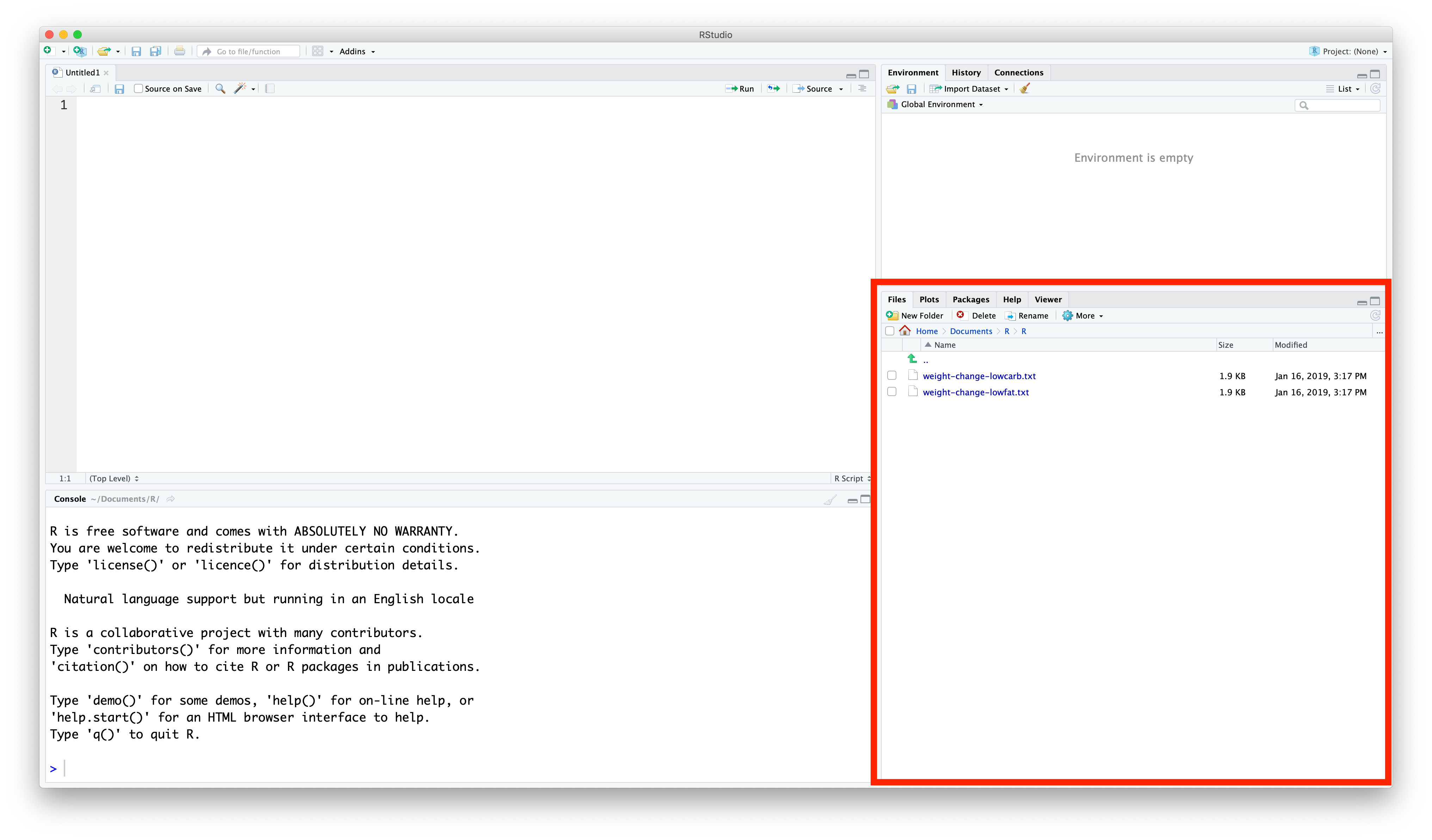
You need to move these files to the same directory you chose in the last section. Navigate to that folder using File Explorer (in Windows) or Finder (in macOS), and move the .csv files to the same folder.
You should now see the files in the Files pane (bottom-right corner) of Rstudio:
The data is stored in a comma separated values (CSV) file. You can open the file using Notepad, but it will be easiest to explore using RStudio.
To load the data, use R's read.csv command. Copy and paste the code below into the R script you created in the previous step.
weightloss.data = read.csv('weight-change-lowcarb.txt')
If this is your first introduction to programming, the statement above does two things: it calls the function read.csv with the argument 'weight-change-lowcarb.txt' (everything to the right of the equal sign), and then assigns what that function returns to the variable weightloss.data. Note that in progamming, = does not mean equality, as it does in math, but rather assignment. In fact, R also allows you to use:
weightloss.data <- read.csv('weight-change-lowcarb.txt')
to do the same action. I will generally not use this convention, since it is unique to R, but you may see it used if you go Googling for code fragments.
If you know other programming languages, it's important to note: R typically uses . where other langauges would use _ (read_csv) or camelCase (readCsv). All programming languages have their idiosyncrasies, and this is one of R's.
You can now 'Run' this command through R by clicking the Run button. After you run
You should now see the weightloss.data data frame in the top-right environment tab in RStudio.
If you click on weightloss.data in this tab, it will bring up the data as a spreadsheet.
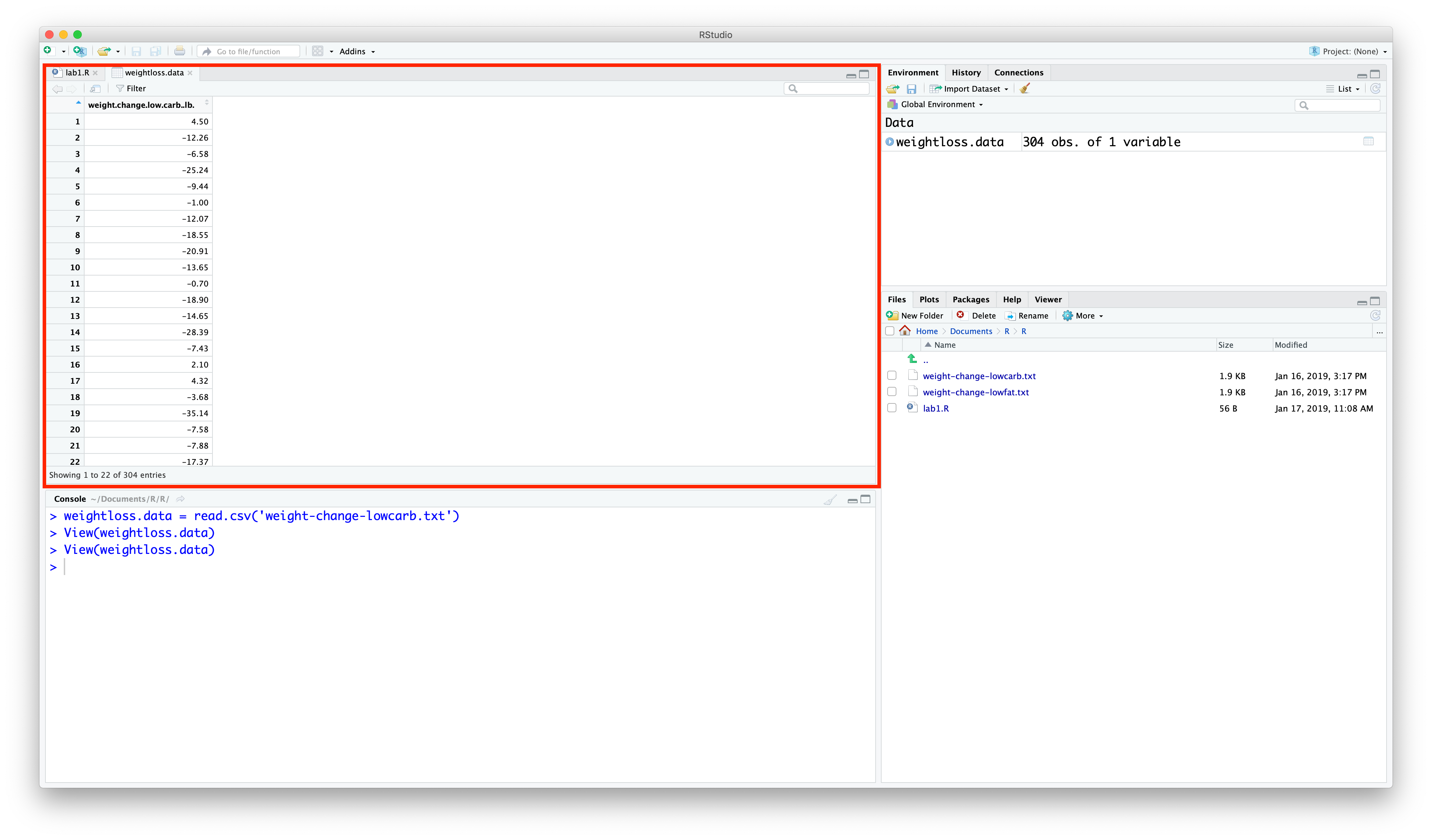
This spreadsheet should look familiar from past experience with other spreadsheet applications like Excel, Numbers, Google Sheets, etc.
It's always a good idea to inspect a new data set for any problems. You can sort the values by clicking on the column name weight.change.low.carb.lb, which will sort the values from smallest to largest. Remember that a negative value indicates weight lost.
Hands On 1
Sort the weight loss values from the greatest weight loss to the greatest weight gain.
Question 1: What was the greatest weight loss? The greatest weight gain?
Creating a Rug Plot
It's hard to get a feeling for how the weight differences are distributed just by looking at the table of numbers. Let's create a simple rug plot to visualize the data spread out on the number line.
Copy-and-paste the code below into your R script, and run it line-by-line in RStudio.
plot(weightloss.data$weight.change.low.carb.lb,
     rep(0, length(weightloss.data$weight.change.low.carb.lb)),
     pch = 16, cex = 0.5,
     xlab = 'Weight Loss (lb)', ylab = '', yaxt = 'n')

Hands On 2
Use the rug plot to answer the following questions.
Question 2: Based on the rug plot, what was the greatest weight lost? The greatest weight gained? Does this agree with your answers from the previous question?
Question 3: What is the approximate mean of the weight losses? Does this indicate that the participants lost weight or gained weight, on average?
Creating a Histogram
Even with the rug plot, it isn't so clear how the values are distributed. Let's use R's histogram function to generate a frequency histogram.
From here on out, I will not say, "Now copy-and-paste the code into your R script and run it line-by-line," but when you see a block of code, that it what you should do.
hist(weightloss.data$weight.change.low.carb.lb,
    xlab = 'Weight Loss (lb)', main = '')

Hands On 3
Use the histogram to answer the following questions.
Question 4: What bins did R decide to use to construct the histograms? List out the list of bins using interval notation, i.e.
Bin 1: $[a_{1}, b_{1})$
Bin 2: $[a_{2}, b_{2})$
What bin width did R use?
Question 5: Which bin has the most study participants in it? Approximately how many participants are in this bin? What range of weight did they lose?
We can add a rug plot to a histogram by using the rug command.
hist(weightloss.data$weight.change.low.carb.lb,
    xlab = 'Weight Loss (lb)', main = '')
rug(weightloss.data$weight.change.low.carb.lb)

Creating a Boxplot
We can also use R to generate a boxplot for the data.
boxplot(weightloss.data$weight.change.low.carb.lb,
        ylab = 'Weight Loss (lb)')

Hands On 4
Use the boxplot to answer the following questions.
Question 6: What is the median weight loss?
Question 7: Based on the boxplot, does the data seem to be symmetrically distributed around its median? How do you know?
We can add a rug plot to the boxplot as well, using the rug command.
boxplot(weightloss.data$weight.change.low.carb.lb,
        ylab = 'Weight Loss (lb)')
rug(weightloss.data$weight.change.low.carb.lb,
    side = 2)

Computing a Suite of Descriptive Statistics
So far, we have considered visual representations of the distribution of the weight loss data. Let's compute some summary statistics (mean, median, quartiles, etc.) using R's summary command.
summary(weightloss.data$weight.change.low.carb.lb)
Hands On 5
Use the output from summary to answer the following questions.
Question 8: What is the mean weight loss? Does this agree with your estimate from the rug plot?
Question 9: What proportion of study participants had a weight loss of more then 21.41 lbs? A weight gain of less than 5.287 lbs?
Once More, with Carbs!
Repeat the analysis that you performed above, but now using the data from the low fat group. So you need to load in the data, create a rug plot, create a histogram, etc., but now for the low fat (high carb) group.
Hands On 6
Answer Questions 1-9 again, using the data from the low fat group. Label these 1b, 2b, etc.
Hint: If you name your dataframe intelligently, you should only have to change one word each time you reference weightloss.data$weight.change.low.carb.lb in your script.
Question 10: Which group had a greater weight loss on average? Does this prove that one diet would be better than the other if prescribed to the general population? Why or why not?